If you’re going mobile, it’s a great opportunity to streamline your content creation and meet the needs of a whole new audience.

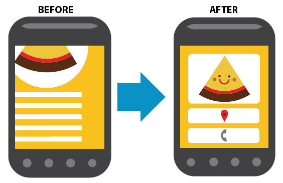
(source: AdCorp)
Know your audience
The way people read on a mobile device and the type of content they’re looking for is very different to desktop. In some cases, you may even have a completely different audience on mobile.
So take some time to think about who will use your mobile site. What tasks will they be looking to complete? What content is most useful to them on the go?
It’s usually a different list from the one you’ll have for your desktop site, so it’s vital you understand who you’re targeting before you start creating content.
It also provides the basis for your site structure and makes sure your site hierarchy matches your users’ likely tasks, here is a great post from Creative Bloq about how to create a responsive HTML wireframe.
Identify how your content will appear
Another thing to consider before you write a word is how the content will appear. Not just on mobile vs desktop, but right down to the specifics of iOS, Android and Windows Phones. It’s a good idea too to check your site analytics to see which browsers and operating systems the majority of your users are using.
Every browser will display pages differently, so create a test page and try it out on a whole host of different devices.
That way you’ll be able to spot any issues early and you’ll be able to set rules around mobile content creation that makes sure the pages you create work well on every device.
(source: Salty Waffle)
Create mobile-friendly formats
Whether it’s a responsive site or a mobile site, you won’t get far without formats – or copy templates – for your key pages.
As this blog post from copywriting agency Sticky Content explains, formats are ‘a great way of structuring content items of the same time’.
Particularly when you have multiple authors working on content, they give you a repeatable way to produce useable, search-friendly content. If you already have formats for your content, it’s a good idea to review them for mobile and make sure they work for the small screen too.
And if you’re moving towards a responsive site, formats can also help you identify elements you could re-use.

Creating efficiencies and re-using content
By breaking down your content into a series of modules, you can create a single page with elements that double up as Facebook posts, teaser text, meta descriptions, email subject lines or related links.
Start by working out which elements of your content you can re-use. A headline for example could be used as an email subject line or a standfirst as a tweet and teaser copy for an A-Z or listings page.
Once you know that you can start to work on defining character counts and putting together a format with a series of modules that allow you to re-use many different elements from a single article.
Provide a seamless experience
Your primary focus might be mobile, but don’t forget your desktop site. Users are increasingly using a combination of mobile and desktop to complete a task.
It’s called sequential screening and it happens when you start a task on one device and complete it on another.
So make sure the mobile and desktop experiences complement one another. A hierarchy of pages can be useful to identify what tasks a user might be trying to complete on mobile and the ones they’ll want to complete on desktop.
Your site structure should mirror this so as users move from one device to another they can quickly and easily complete their task.
Train your teams in mobile best practice
Your content strategy is just the start – after that you’ll need to start writing. So it’s a good idea to organise a writing for mobile training course to bring your teams up to speed.
Whether it’s the basics of mobile copywriting or introducing them to your new formats and elements of reusable copy, it gives your teams the knowledge they need to put everything into practice.

