Every week we collect some of the best web and digital design resources that will be useful for designers. Check out any of the links below and leave any comments about your favourites in the replies.
FREEBIES
Font : Mast

Mast is designed by NACH OH. This is an uppercase font and comes in 2 styles ( dark and light) per font.
Link: Font : Mast
Font : Indulge

Indulge is designed by Anthony James. Indulge Script™ is a typeface adapted for both modern and traditional uses, housing 882 glyphs and 480 swashes. With hundreds of thousands of character combinations to choose, to ensure a more creative and original experience.
Link: Font : Indulge
Free modern dashboard interface

The dashboard includes only one screen – the overall look is great and the design seems to be very balanced, so have a deeper look for study purposes or just to get inspired.
Link: Free modern dashboard interface
Essential Collection: 500 free vector icons
Essential Collection is a free featured set of 500 outline icons available for personal and commercial use. Icons are based on 32px grid and cover many categories, that makes them ideal for any kind of web and mobile projects.
Link: Essential Collection: 500 free vector icons
INSIGHTS
Mobile in The Future
For the past five years, I’ve presented an overview of the mobile design topics, insights, and solutions I’ve been focused on at Google’s Conversions event in Dublin. This year’s video recording on what’s changed in mobile design over the past ten years and where we could/should go next is now live.
Link: Mobile in The Future
7 Steps to a Flawless Design Review

The design review can be one of the most stressful milestones in any website project. While feedback is a valuable part of the overall process, sometimes the process of getting there is complicated and unwieldy.
Link: 7 Steps to a Flawless Design Review
Modern Favicon and Icon Development Techniques and Best Practices

Since its debut in 1999 with Microsoft’s Internet Explorer, the favicon has expanded in scope thanks to adoption by modern browsers and operating systems. Although it was originally a tiny 16×16 pixel icon appearing in a browser’s address bar, favicons now also provide high-resolution visual assets for websites pinned to a mobile device’s home screen, a Windows 10 favorites tile, and much more.
In addition to being helpful to the user, these icons are just another level of polish designers and developers can apply to help a website stand out.
Link: Modern Favicon and Icon Development Techniques and Best Practices
A/B Testing and Usability: The Ultimate Guide from A to B

A/B testing is more commonly known than usability testing, mainly because of the A/B testing tools we can find in eCommerce platforms, website design software and email marketing systems.
In short, A/B testing takes two versions of a digital element, like a webpage, landing page, sign up form or email newsletter and tests them against each other.
Link: A/B Testing and Usability: The Ultimate Guide from A to B
The Ultimate Guide to User on-Boarding – Tips and Best Practices

On-boarding design should be based on data collected on your target audience/potential users. Does your audience have experience using similar products before? How complex is your product? What level of complexity in the user interface can they handle? Asking questions like these help you to create your audience profile.
Link: The Ultimate Guide to User on-Boarding – Tips and Best Practices
INSPIRATION
10 Outstanding Call-to-Action Examples

The good old Call-to-Action (CTA) has become a staple of the web. They’re around to tell users exactly what we want them to do. Buy this book, download our free guide, contact us for more information, etc.
Link: 10 Outstanding Call-to-Action Examples
Huffpost Unveils New Design

The Huffington Post, now officially referred to as “Huffpost” has a completely new site design to go with its name and logo change. It has added a fair splash of black to go along with the white and green.
Link: Huffpost Unveils New Design
YouTube concept

Link: YouTube concept
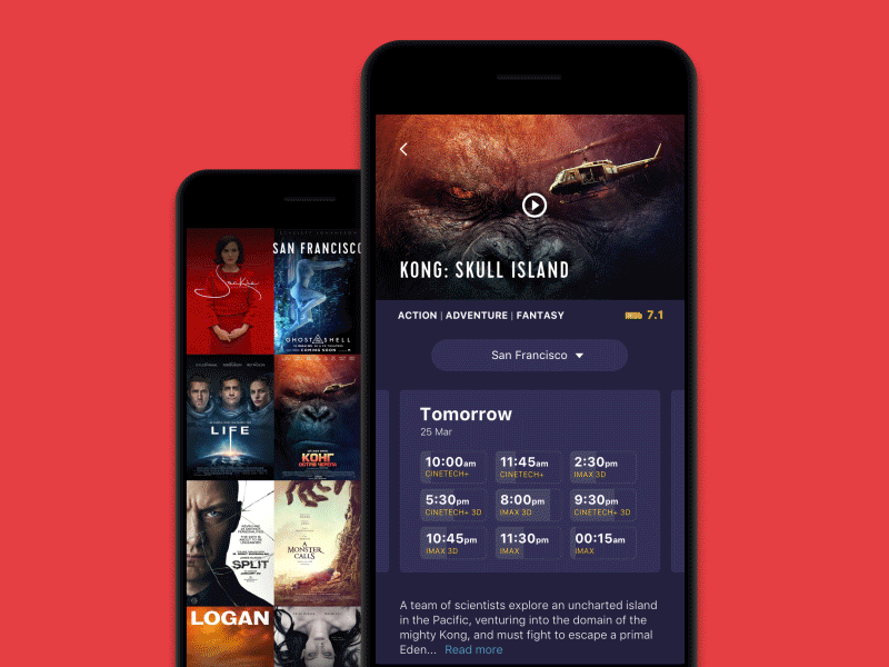
Cinema App Interactions
Link: Cinema App Interactions
5 Best Designed Websites in 2017 so far, according to DesignBeep.com

Link: 5 Best Designed Websites in 2017, according to DesignBeep.com

