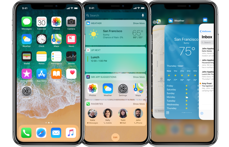
This is a guest post by Alissa Davis, a tech writer and enthusiast who has been following the debate around the iPhone X. In this article, she has gathered important information about the iPhone X UI design that designers and developers should understand. All images via Apple.
Apple unveiled the iPhone X during an event that also marked the 10th anniversary of the first iPhone being unveiled in 2007. The journey across those 10 years has been smooth, but with the release of the iPhone X, which has come with virtually everything different, designers have a lot of work to do to produce apps and mobile interfaces that can match the new UI requirements. But this should not worry you, as it is less like a nightmare than it is a breakthrough that should help you up your game in iOS mobile development and design.
Here are new specs and features to include in UI design for the iPhone X and how to design them.
1. Apply the new iPhone X artboard size
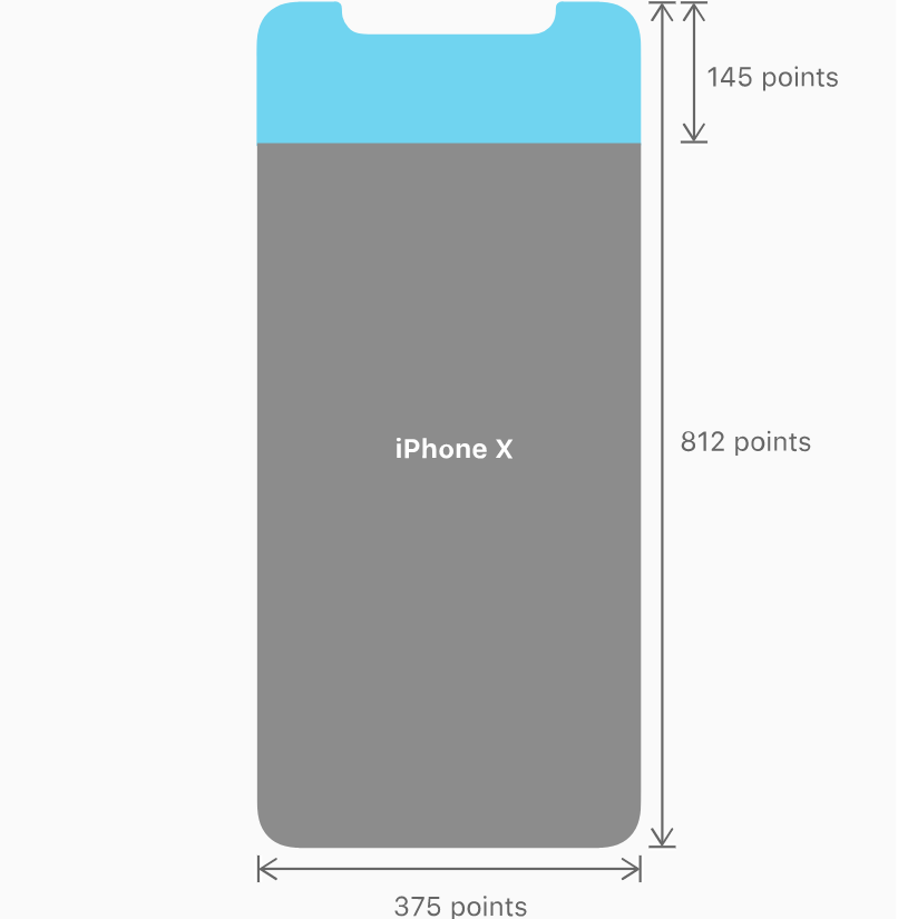
After removing the home button, Apple managed to increase the height of the screen by 20%. This 20% increase translates to 145pt (pt being pixels given in non-retina units) worth of design space.
This means when you design for iPhone X you should create your artboards using Photoshop or Sketch and they must have a resolution of at least 375 x 812. There is a slight shift from what you usually would adhere to in the past, so consider reviewing the new artboard guidelines.
2. Creating assets to match new pixel density
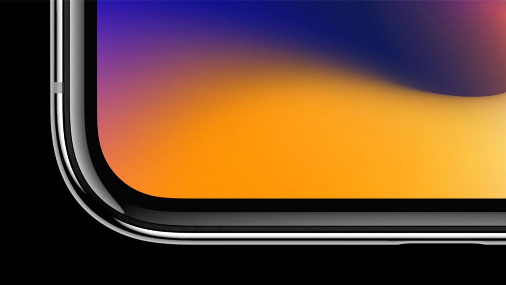
The new display is not only bigger, but it presents another nightmare where the resolution is higher for the size of the display. The phone’s new Super Retina Display comes with a resolution of 2436 x 1125 pixels, and that makes 458ppi.
What this means for a UI designer is that you will be required to export assets @3x and not using the @2x relied on previously. It sounds like a daunting process, but with changes in technology also comes better ways to do things. So when you try this new design convention you might find it more appealing.
3. Don’t forget about the display shape

As mentioned earlier, the iPhone X comes with a taller display, but to add on to this is the fact that it also has rounded corners with a little notch removed from the top to provide space for the front-facing camera and sensors. At the point the notch comes in is where the challenge begins because it creates a scalloped top edge that divides the status bar in two.
You also have to realize that the vertical height allocated to the status bar was doubled to 44pt from 22pt, and all this was to provide a comfortable margin from the corners, which are rounded.
Due to these alterations, Apple has advised UI designers and developers to consider revoking any past decision that would assist them in hiding the status bar. You are asked to design in a manner that will not give light to these display irregularities.
4. Consider the new aspect ratio
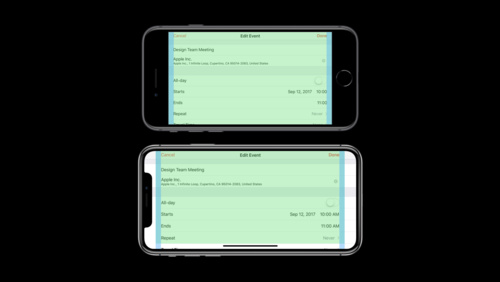
The aspect ratio of the iPhone X is also taller, or wider when viewed in landscape mode, and this means any artwork that was previously produced to match the earlier generations will appear weird.
So, while doing UI design you must consider this fact. The advice most experts offer is that one should come up with separate assets for specific aspect ratios.
5. Gesture interference
To correct the lack of hardware buttons, Apple included many system-based gestures that also require some room. Apple has suggested several things to prevent issues. The first point is that you should not hide the home indicator and second, don’t add interactive buttons near the home indicator.
6. Correct referencing of authentication method
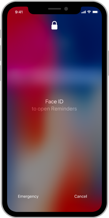
Another new UI issue you should look into is the authentication method mentions you made in the past. While designing for the iPhone X, you should change any authentication mentions that cite Touch ID to read Face ID. The fingerprint scanner was replaced with a face scanning technology.
7. Utilize the more impactful color bundles
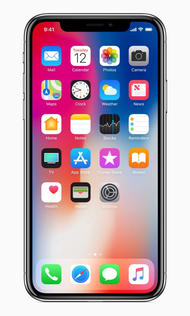
As a UI designer, you are encouraged to give preference to Display P3 Color Space that offers a wider color display, which is ideal for the phone. So, don’t rely on the sRGB as this would not offer the required color display that would match the hardware requirements of the iPhone X.
8. Layout

Many of the apps on the iPhone X will rely on the system-provided UI elements, like tables and navigation bars. But apps that come with custom layouts would have to be designed factoring in the layout requirements, and this means incorporating a design that adheres to the recommended safe areas as provided for by Apple.
There are many margin layout guidelines provided to help you shift your design process into the new convention. Most importantly, developers can now take advantage of the new augmented reality kit (AR Kit) introduced by Apple that allows users to play with surroundings through overlaying their physical world to come up with real-life experiences.
Overall, the new UI requirements present in the iPhone X present a great opportunity for developers and users alike. With small shifts in approach, developers can create an even more user friendly experience for consumers.


