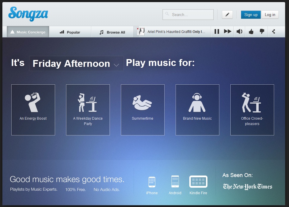
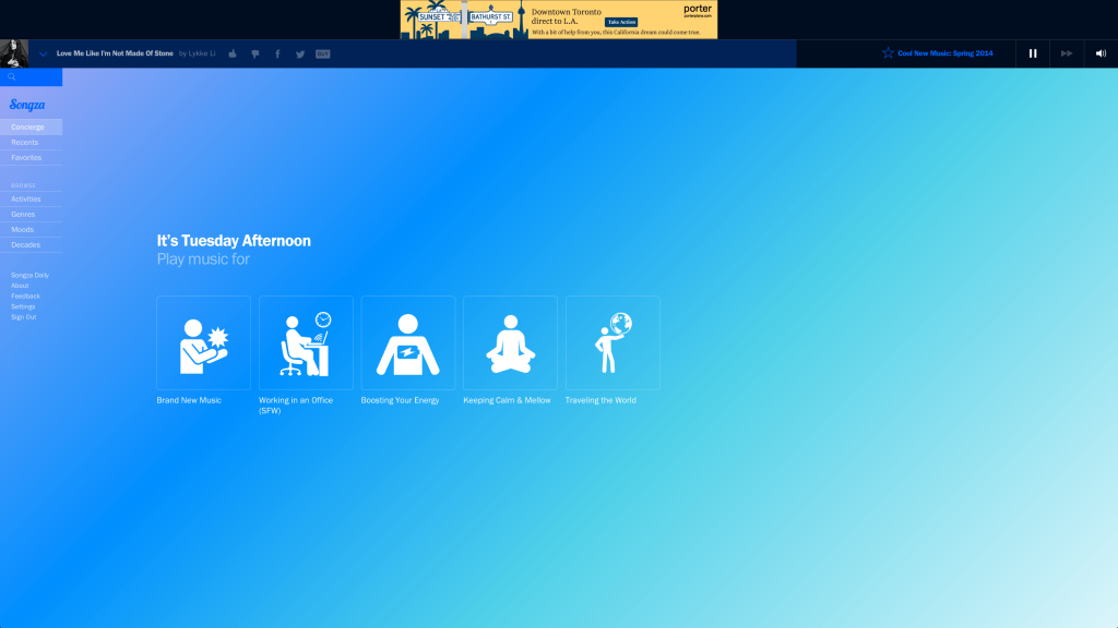
We’ve pointed out before how well designed the Songza app for mobile devices is. Now, the music streaming website has brought its desktop website into the fold with a redesign that adopts elements of its mobile counterparts, but also introduces new elements in a responsive design with intuitive hover states.
Check out the comparison between the before and after below, and see the new site for yourself at Songza.com
Before

After
Landing Page

Now Playing


