
The difference between adaptive and responsive design
The difference between adaptive design and responsive design is that adaptive design adjusts to predefined specifications (or “break points”) and serves up an experience based on whichever specs are the closest. As an example, a site could be set to adapt to dimensions of a standard desktop monitor, an iPad in portrait view, an iPad in landscape view, and an iPhone. If you access a website from a device that falls between the specs of one of the above listed devices, you’re served up the next closest experience. In some cases, as with the new devices mentioned previously in this article, this could result in a sub-par experience for the mobile user (e.g. someone on a phablet viewing a smartphone interface).
Alternately, with responsive design the website’s elements would exist on a completely fluid grid, repositioning themselves in a predetermined structure, but one that always fits precisely to the screen resolution it’s being viewed on. Using responsive design, a phablet user would see an interface somewhere between a tablet and a smartphone – as we think they should (and they would likely agree).
Planning for a responsive website
Planning and designing for mobile is always easier upfront. Even if the client isn’t ready to invest in the mobile interfaces at the outset of the project, by planning for it out of the gate there are efficiencies gained, both in the amount of effort required from a design/development standpoint, and in the resulting associated costs.
Additionally, the approach a client decides to take has a big impact on the way the site needs to be designed. For instance, a responsive site will need to be designed with percentages rather than pixels.
Trying to make an existing website responsive is a much more difficult challenge, and in the end the cost may be such that the client may as well plan for an entire site overhaul.
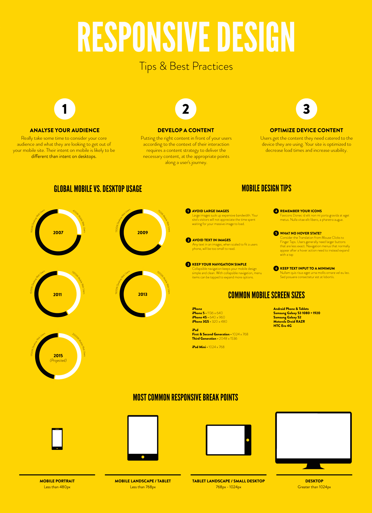
Tips & best practices for responsive design

