Infinite scroll explained
The difference between a Trend and a Standard (using infinite scroll as an example)
Trends
 A trend is a tendency or an inclination for things to move or behave in a certain way. And trends sometimes last for a long time. These general tendencies can (especially in the information age) gain traction and have a global influence. But a trend is not a standard.
To read this (or write it) seems obvious, but “in the moment” we sometimes fall into a trap. A recent example that applies to this audience would be infinite scroll.
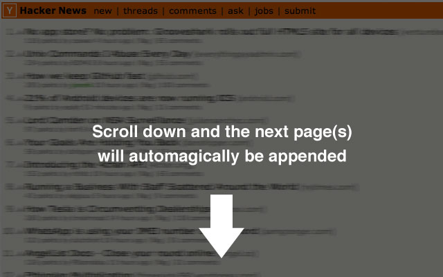
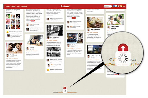
Infinite scrolling is a an approach to web/mobile development where as a user scrolls down a “page” content is loaded continuously. Tumblr, Twitter and many other popular aggregation sites do this as a method to eliminate the need for pagination. This way of interfacing with content is also extremely well-suited for touch screen interfaces like an iPad.
When you’re lazily browsing on the couch on a Sunday morning, infinite scrolling might be a fantastic user experience.
However, it might be really bad for SEO for your site. It might have a seriously negative impact for your action oriented goals. For a shopping experience a user might wonder if the list will ever end (something that can be avoided with pagination).
Unfortunately, infinite scroll is perhaps overused because it’s currently “trendy”.
Standards
“a standard is a guideline that provides a framework for consistency of approach.”
In this context, we would begin to discuss what standards we should apply to the use of infinite scrolling and what to do if you’re using it in your design.
As the purpose of Digital Design Standards is not to dictate, but rather generate discussion (and eventually consensus) these recommendations are purely for example and discourse.
Tips for using Infinite Scroll
Use infinite scroll if:
- The design and the purpose is experiential. The user isn’t there for a specific (or transactional) purpose.
- Content marketing and SEO aren’t the primary purpose (or make sure that you can create component pages for search engines)
- You can control the URL’s so users can link to specific content blocks on the page (as is the case with well-executed pagination)
- You can keep a persistent nav element
- You can show your users their progress within the content (how much content remains, perhaps via a percentage)

Don’t use infinite scroll if:
- The content is primarily text. It takes a long time to read and comprehend copy. This usually negates the positive experience of the approach
- If conversion (like an ecommerce site) is the primary goal
- If it matters whether the user loses their sense of direction within the content
So now we have a trend, and some tips. How do we go about transforming that into a standard? If we can all agree that these tips are correct, we can create a convention, an approach. Once we have this convention we begin formulating a standard.
To create a standard about the use of infinite scroll (for example) we would create a committee of experts, discuss and find consensus.
So I implore the audience of the site to provide feedback and generate discussions. Perhaps guidelines around infinite scroll can be the first Digital Design Standard this platform produces.


