DDS

Blog

Optimizing your mobile content for responsive sites

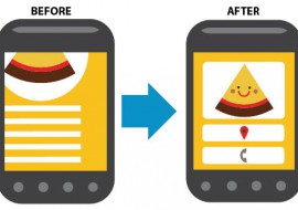
If you’re going mobile, it’s a great opportunity to streamline your content creation and meet the needs of a whole new audience. Know your audience The way people read on a mobile device and the type of content they’re looking for is very different to desktop. In some cases, you may even have a completely different audience on mobile. So take some time to think about who will use your mobile site. What tasks will they be looking to complete? What content is most useful to them on th...

Trends vs. Standards: Infinite Scroll

The difference between a Trend and a Standard (using infinite scroll as an example)   Trends A trend is a tendency or an inclination for things to move or behave in a certain way. And trends sometimes last for a long time. These general tendencies can (especially in the information age) gain traction and have a global influence. But a trend is not a standard. To read this (or write it) seems obvious, but “in the moment” we sometimes fall into a trap. A recent example that applie...

Nike Attempts to Establish a “Standard” of its Own in Fitness Tracking

Nike is looking to take its established NikeFuel fitness tracking points to a new level, and make its homegrown activity platform the Standard for all fitness and wearable devices. If you're not familiar with it, NikeFuel is the points system that can be earned through Nike+ apps like Nike+ Running or Nike+ Moves, as well as through Nike's own hardware, the FuelBand. But the latest move by the company is aiming to position itself at the center of the burgeoning fitness and wearables marke...

Digital Design Resources: April 7, 2014 Edition

Designing for Wearables If you haven't yet heard about Android's venture into wearable computing, this selection of concepts dreamed up by designers for the smart watch UI should get you interested. Check out a sample of them below, or see them all at the following link: Designer Concepts on UIs for the New Android Moto 360 Watch     Dark web design Though recent web design trends have leaned more towards white space and away from all dark websites, when it's done right i...

Beautifully (re)Designed: Songza on the Desktop

We've pointed out before how well designed the Songza app for mobile devices is. Now, the music streaming website has brought its desktop website into the fold with a redesign that adopts elements of its mobile counterparts, but also introduces new elements in a responsive design with intuitive hover states. Check out the comparison between the before and after below, and see the new site for yourself at Songza.com Before   After Landing Page Now Playing ...

Designing for a Gesture-based Future

One of the things that we try to do is imagine the future of interactivity so that we can build not only the user interfaces required, but the underpinnings to control, manage and tie it all together. It’s this curiosity and forward thinking that led us to imagine a world in which we interact with information via gesture; whether the application is signage, communications, healthcare, or retail. We’ve spent the last year and a half evaluating the state of technology, from Kinect, Leap Mot...

Responsive Web Design in PhotoShop

Responsive web design is more than just a way to optimize your site for mobile devices  –  it's also a way to think about designing for the digital landscape in general. If you have yet to venture into creating a responsive design using PhotoShop, this video will get you started with what you should be doing.   ...

Your Name in Gum

It might not be the most appetizing design, but Your Name in Gum keeps content as its main focus, and everything else minimalistic. When you arrive on the site, you select your type of gum, then from there you can type out your name. The result is something like a custom font with your name in chewed up gum. See it for yourself at yournameingum.com  ...

Squarespace and Mouse-Tracking Animation

Squarespace’s website not only features animations on a computer screen that demonstrate the platform’s benefits, but the background of the site appears to shift in its perspective based on the movement of your mouse. This variation of a parallax effect is a prominent design feature of iOS 7 and is now beginning to make its way into web design, as well. See the site for yourself at squarespace.com ...

Financial Times – HTML5 Web App

The Financial Times recently debuted a beta version of their new website, which gives reading the news on the web a modern, app-like look and feel, intermingled with elements reminiscent of printed newspapers. The site is full of interactive elements, videos and animations that make the experience of reading articles on the site similar to what you’d expect from an iPad. Check out the new site at app.ft.com...

Great Examples of Responsive Design

Over the past few years, responsive design has been one of the most popular options when optimizing a website for viewing on mobile and tablet devices. The following are some great examples of responsive websites.   nclud.com  

Unique Content Presentations

What appeals to me is content – the quality, the ease of access via multiple platforms, and intuitive and simple UI. Feedly feedly.com – Essentially a cooler version of the now-defunct Google Reader; a content aggregator.   Songza songza.com – Offers curated playlists to you depending on your mood, the time of day, or by genre.   It’s also fashion week in NY right now. One of the sites that I find really well done and quite different yet stark, simple...

Load More